
MIKE HESS BREWING
PACKAGE DESIGN
Crafted Identity for Mike Hess Brewing: Celebrating Tradition and Flavor Through Design
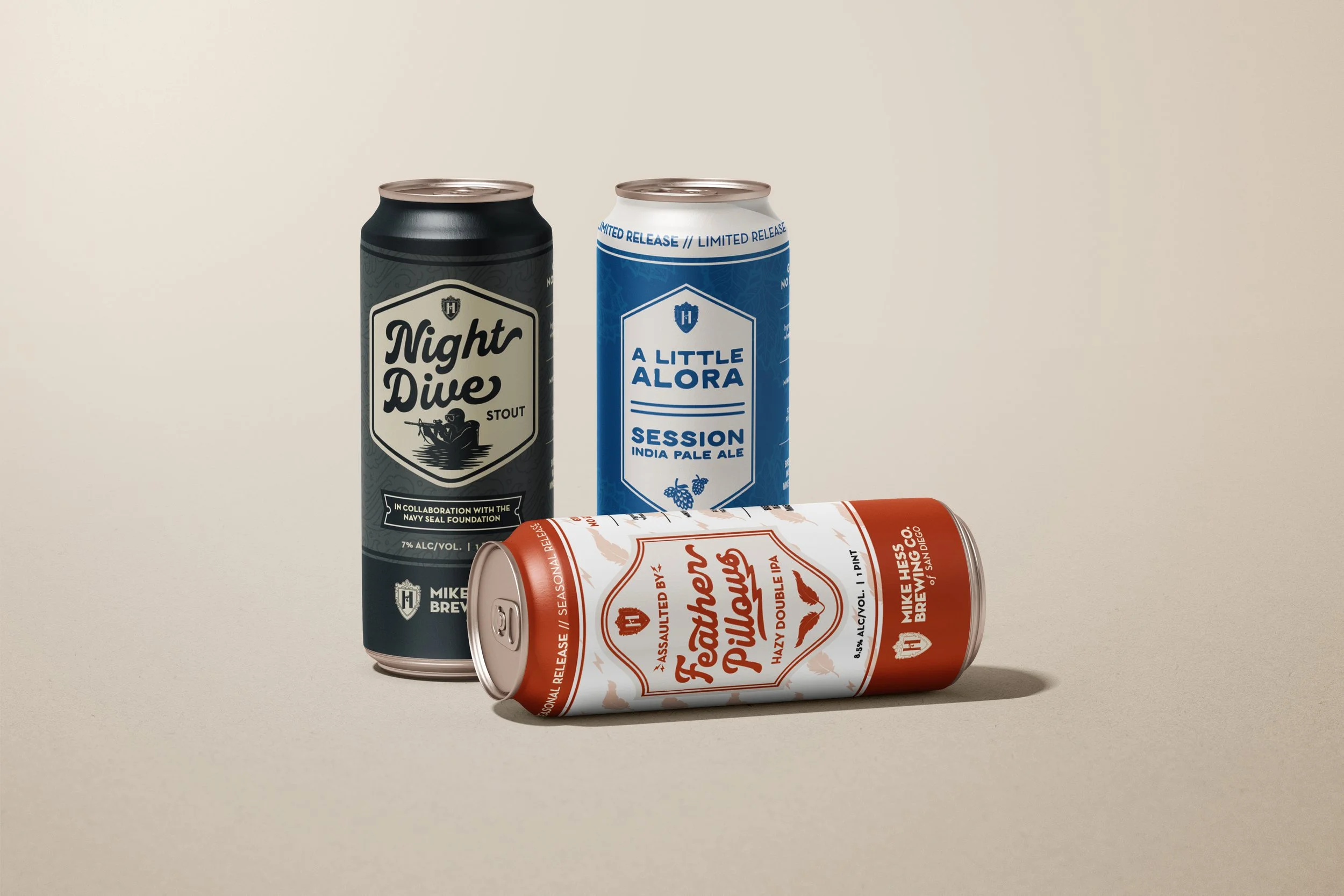
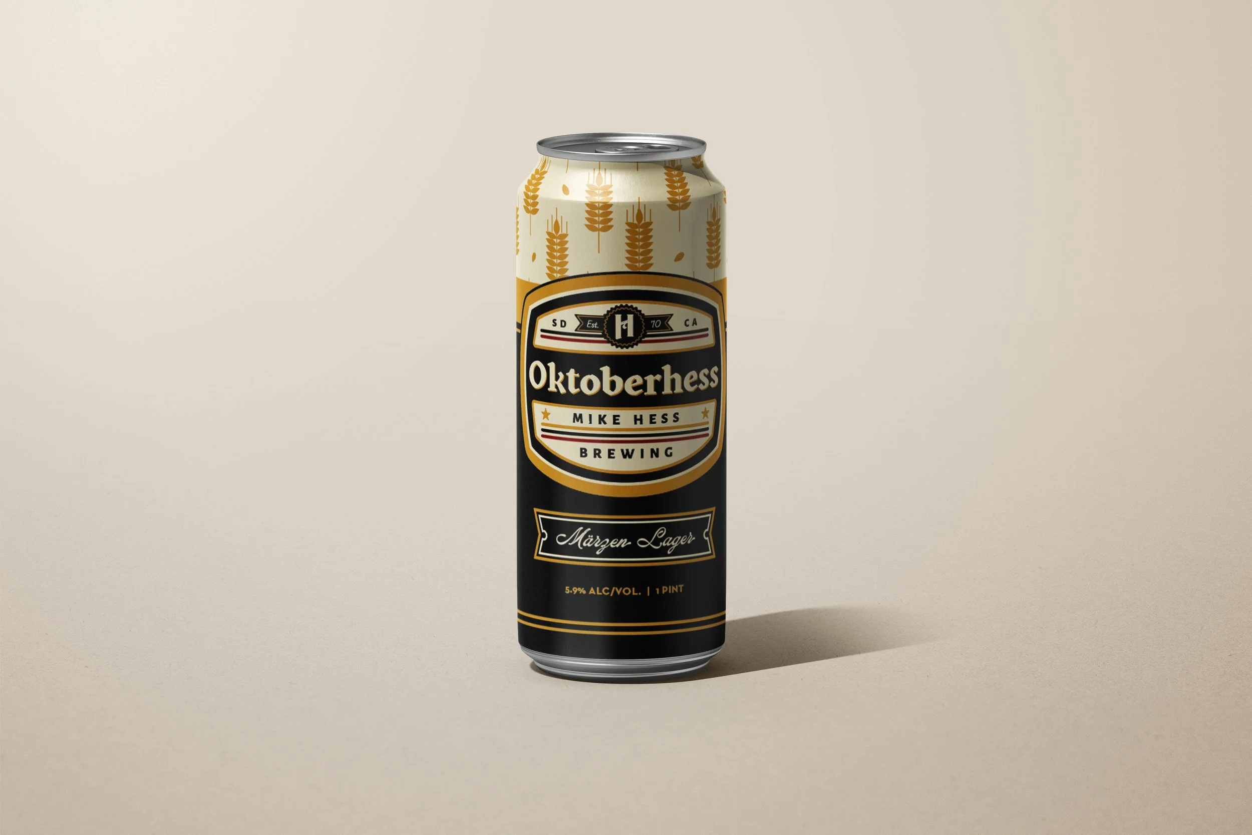
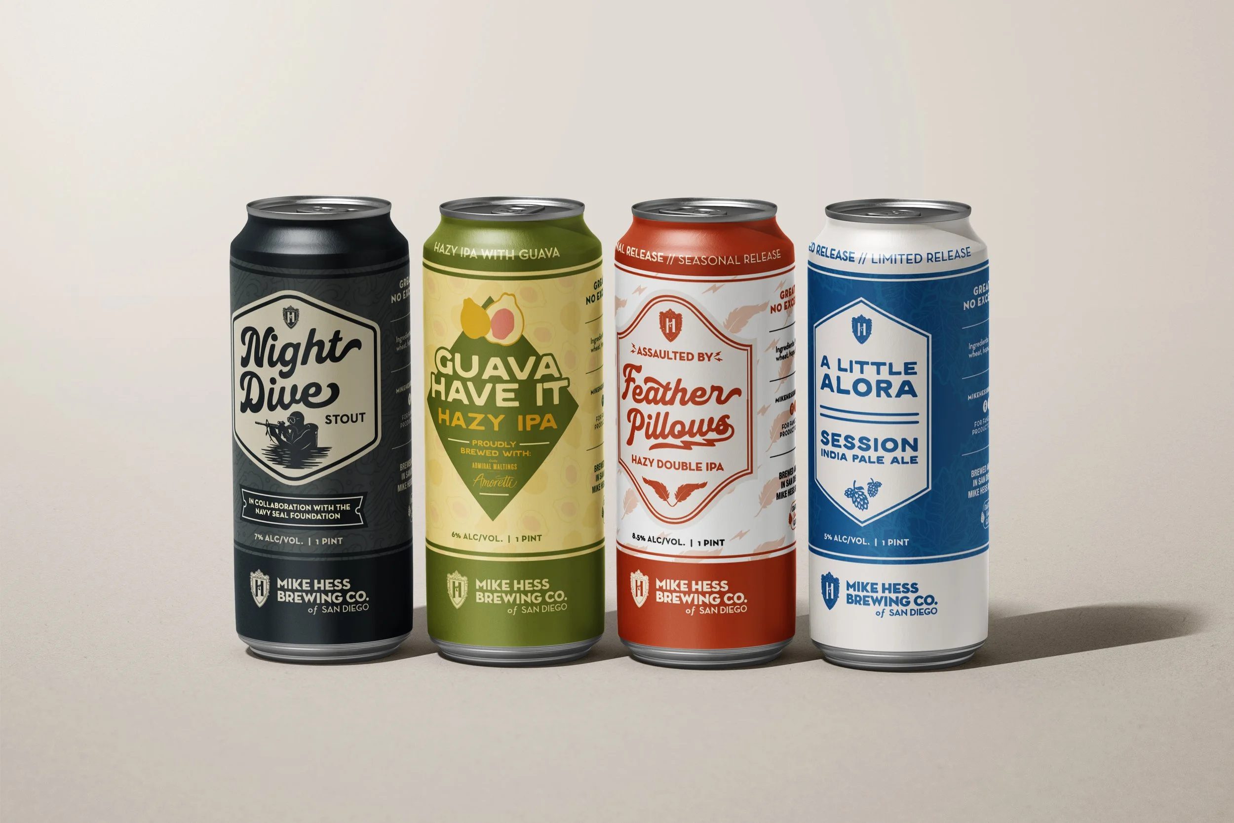
Vida Creative has collaborated with Mike Hess Brewing, one of San Diego’s most established independent breweries, to design packaging that honors their craft, community, and storytelling.
From OktoberHess to their rotating Festbier series, each label balances heritage and modernity, combining bold typography, refined layouts, and detailed illustration work that nods to traditional German brewing while staying true to the brand’s coastal California roots.
Our approach focused on visual consistency across seasonal releases, ensuring each design feels distinct yet unmistakably part of the Mike Hess family. The result is packaging that not only stands out on the shelf but also deepens brand recognition, celebrating the artistry behind every pour.
-
Each label is designed to capture the spirit of your product while balancing storytelling, functionality, and visual impact. From composition and color to typography and texture, every detail works together to create packaging that stands out on the shelf and strengthens brand recognition across every release.
